Case study · Hospitality · Tokyo
Helping Japanese food lovers choose the right cooking class
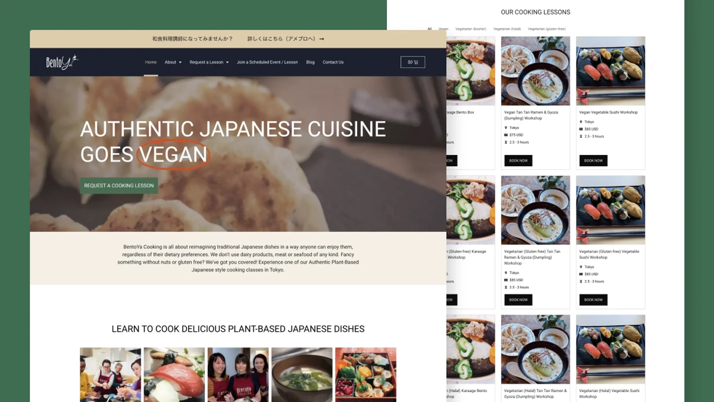
TL;DRThe outcome
Visitors couldn't find the right class, so they emailed staff — or left. After restructuring the site around classes and dietary needs:
- Class directory visits doubled (4% → 8%)
- Time on site increased by over 50%
- ~5% of visitors now go straight from the homepage to a specific class
01Background
Bentoya Cooking offers Japanese cooking classes in Tokyo, with vegan, vegetarian, halal and kosher options for international visitors. Those options existed — but you'd never know it from the homepage.
I had previously supported Bentoya with technical maintenance and WooCommerce setup. This project's goal: help visitors find classes matching their dietary needs, without emailing first.
02The discovery problem
Analytics and staff feedback pointed to three problems:
- Classes were hard to find. Only 4% of visitors ever reached a class page — on a site built around classes.
- Dietary information didn't help. Labels existed but weren't visible or filterable. Visitors browsed, felt unsure, and emailed staff.
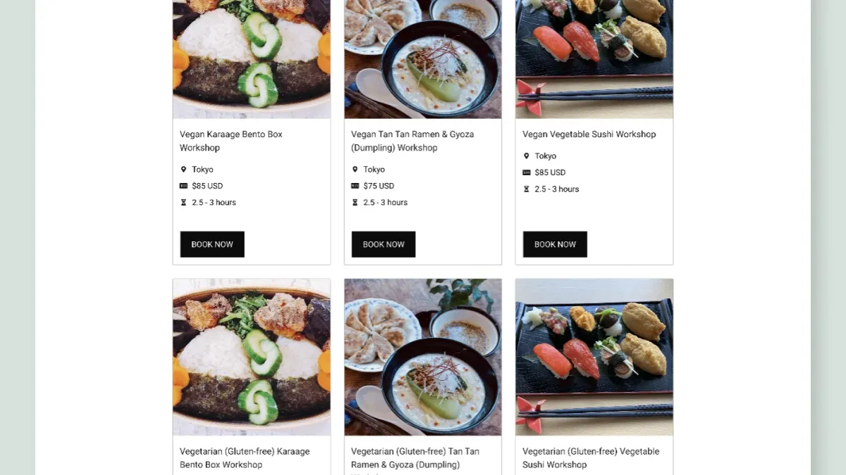
- Key details didn't scan. Duration, location, price and dietary options weren't grouped, so comparing classes was work.
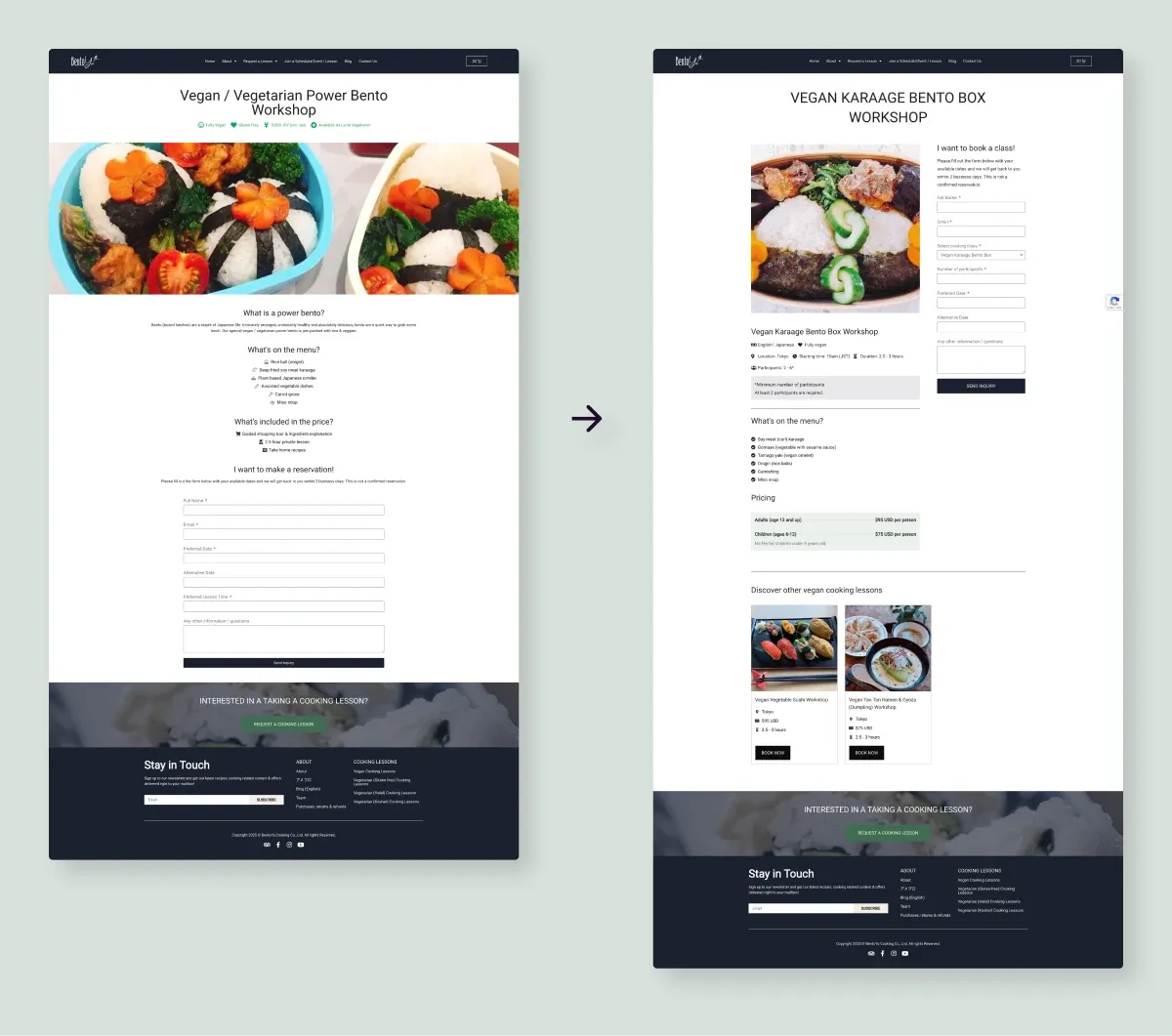
03What I did
I led the UX and UI redesign with a focus on class discovery for international visitors. With no budget for formal research, I triangulated Google Analytics, staff observations, and comparison studies of Cookly, airKitchen and Veecoco to learn how people expect to browse cooking classes.
- Restructured the homepage to show class options immediately
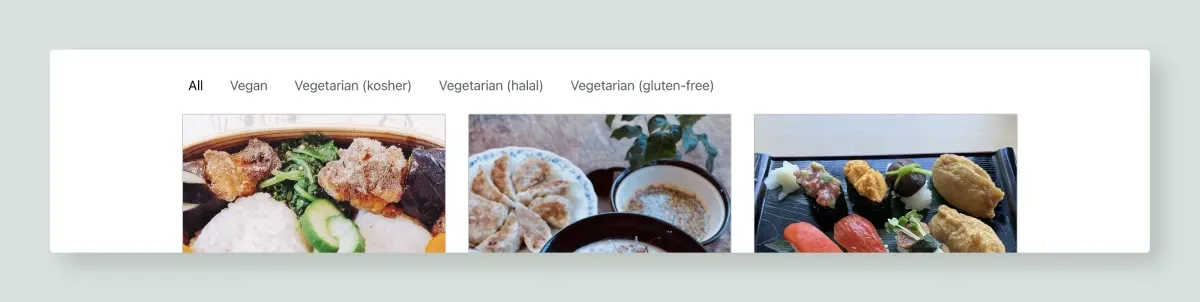
- Implemented dietary filtering with category-based navigation
- Built scalable components the team maintains themselves
- Improved typography, contrast and hierarchy for accessibility
04Reflection
Working within WordPress/Elementor constraints taught me to design systems the client can genuinely own. The best measure of this project isn't the analytics bump — it's that staff spend less time answering "do you have a vegan class?" and more time teaching.
Want the full process — research, iterations and the feedback that changed the design? Read the extended version →