Extended case study · Hospitality · Tokyo
Helping Japanese food lovers choose the right cooking class
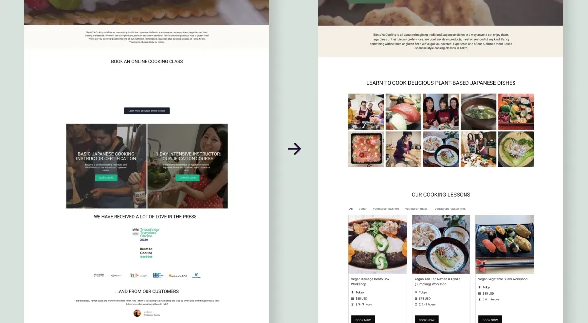
Extended case study — includes research, iterations and feedback rounds. Short on time? Read the condensed version →
TL;DRThe outcome
Visitors couldn't tell which classes fit their diet, so they emailed staff or left. I restructured the site around classes and dietary needs. The numbers moved:
- Class directory visits doubled (4% → 8%)
- Time on site went up by more than 50%
- About 5% of visitors now go straight from the homepage to a specific class
01Background
Bentoya Cooking teaches Japanese cooking in Tokyo and offers vegan, vegetarian, halal and kosher options for international visitors. The options existed. The homepage just didn't show them.
I had supported Bentoya with technical maintenance and their WooCommerce setup for years, so I knew the platform well. The goal for this project: let visitors find a class that fits their diet without having to email first.
02The discovery problem
Analytics and staff feedback pointed to three problems:
- Classes were hard to find. Only 4% of visitors reached a class page, on a site that exists to sell classes.
- Dietary information didn't help. The labels existed but weren't visible or filterable. Visitors browsed, felt unsure, and emailed staff to ask.
- Key details didn't scan. Duration, location, price and dietary options weren't grouped, so comparing classes took work.
Mapped as a journey, the friction is easy to spot. An email round-trip sat in the middle of every uncertain booking:
- Browse classes
- Dietary question comes up
- Can't see which classes fit
- Email staff & wait
- Book — or give up
03Research with what I had
There was no budget for formal user research. Instead I worked with three sources: Google Analytics, staff observations, and the existing site structure. The staff hear the same question every week — does this class fit my diet? — and the analytics backed them up. Discovery was the barrier.
I also studied how Cookly, Veecoco and airKitchen handle discovery. People who book cooking classes online already have habits, and I wanted the site to match them:
| Pattern | Cookly | Veecoco | airKitchen | What I chose |
|---|---|---|---|---|
| Homepage class display | Featured classes | Categories | Featured classes | Featured classes on the homepage |
| Categorization | Yes | Yes | Yes | Dietary labels as the base for categories |
| Filters | Location-based | Vegan focus | None built in | Dietary category filters |
| Content hierarchy | Right-side booking column, left-aligned | Pricing card + imagery | Price in fixed bottom bar | Right-side booking, clear headings, left-aligned |
04Two feedback cycles
I ran two review rounds with the Bentoya team. This wasn't formal usability testing, but the staff talk to customers every day, and that knowledge kept the design grounded in real questions from real visitors.
Cycle 1 — structure
- Draft v1 → staff review → changes
- Focus: clarity, structure, class descriptions
Cycle 2 — trust
- Draft v2 → staff review → final
- Focus: pricing transparency, polish, final alignment
Most of the feedback was about copy clarity and pricing transparency. Both shaped the class cards and page structure below.
05The solution
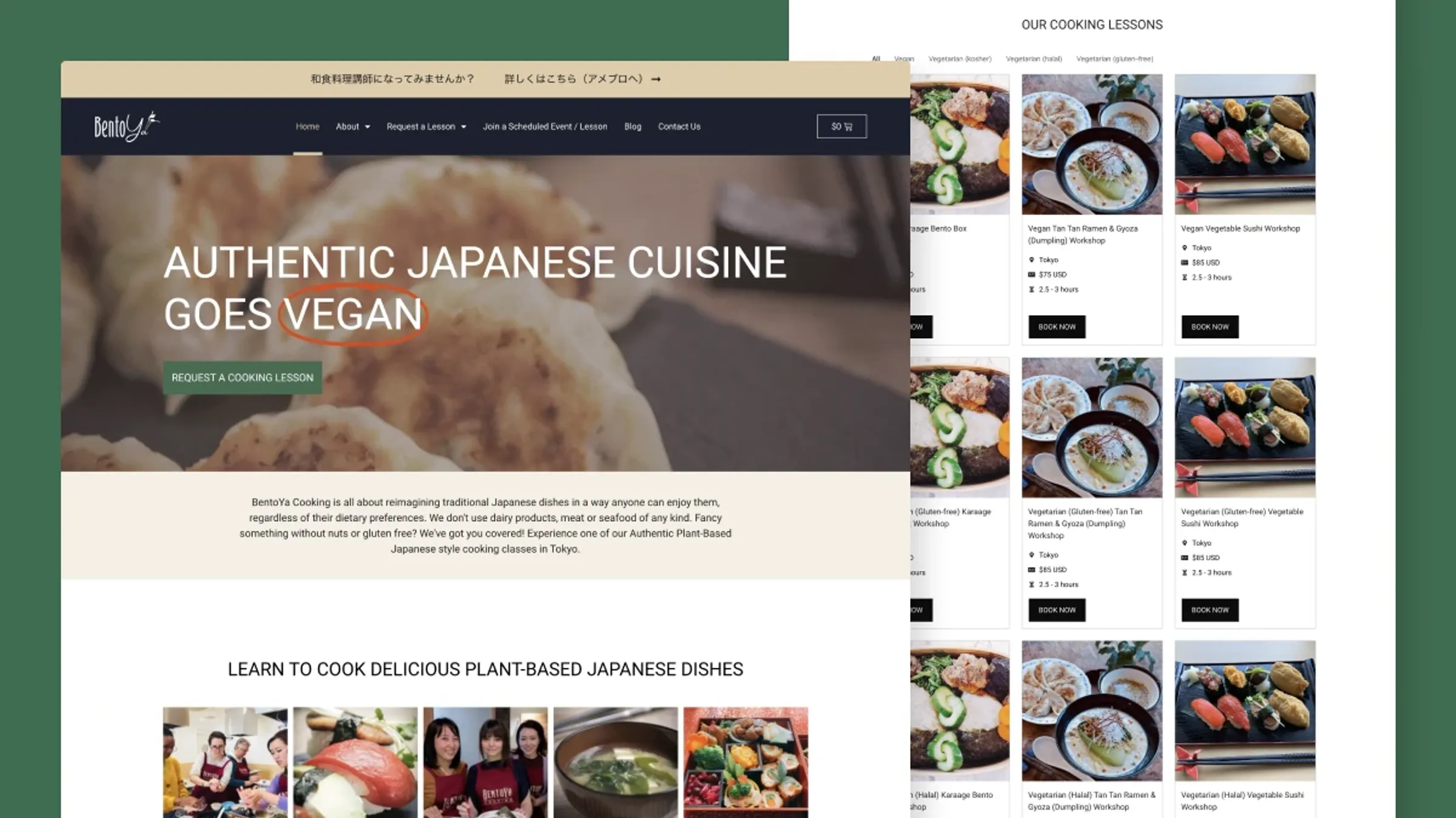
Classes visible from the homepage. The new homepage leads with classes and key details, with filters to narrow down fast.
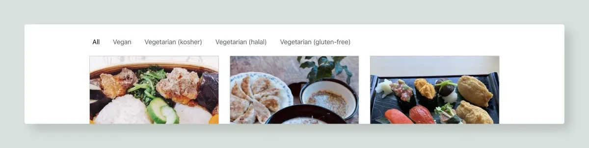
Dietary filters visitors can act on. Choose vegan, vegetarian, kosher, halal or gluten-free and see matching classes instantly. No email needed.
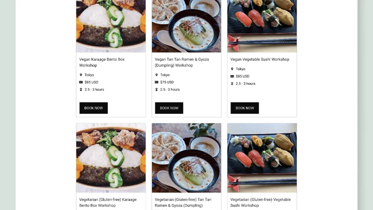
Class cards built for comparing. Name, duration, location, price and a clear booking button. Built as reusable components with custom fields, so the team updates them without me.
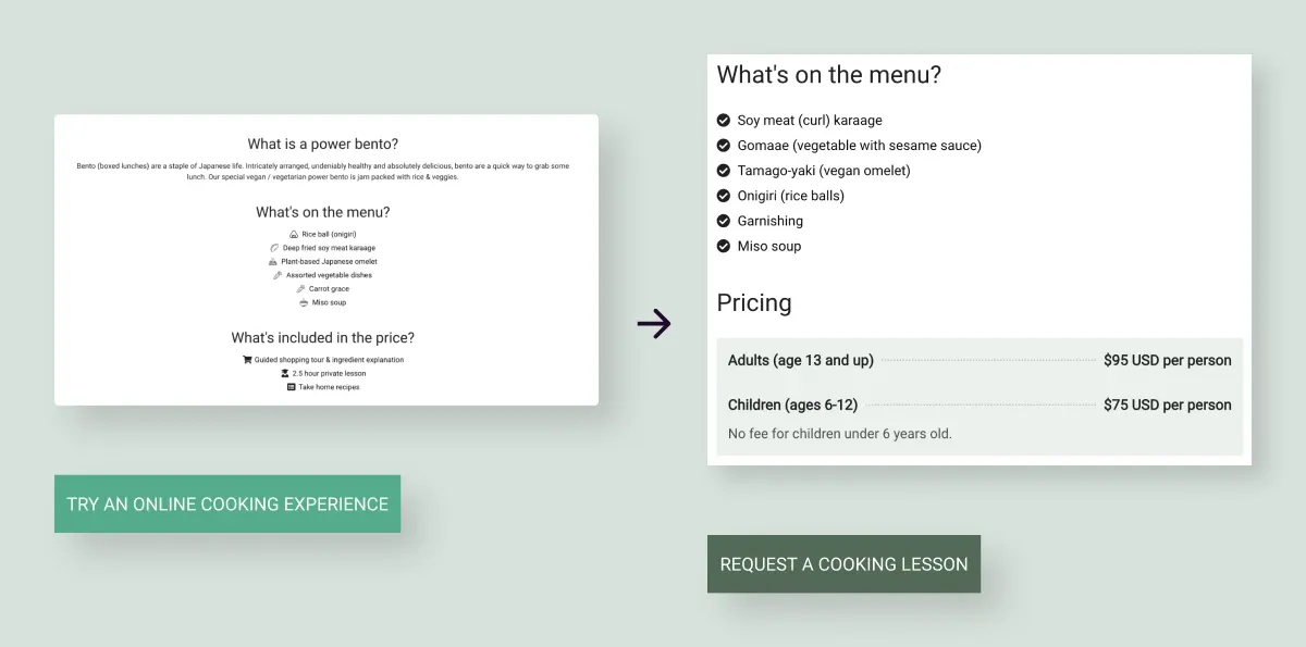
Class pages restructured for action. The booking form moved higher, content became left-aligned and scannable, and pricing sits in context instead of at the end.
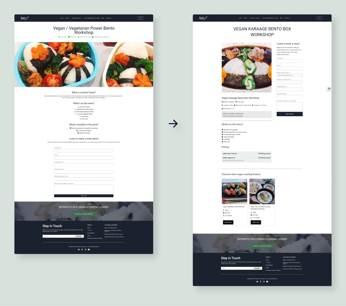
Accessibility was part of the fix. Text contrast went from 2.77:1 to 6.04:1, meeting WCAG AA, with cleaner alignment, heading hierarchy and spacing.
06Results
- Class directory visits doubled (4% → 8%)
- +50% time on site, suggesting visitors explore classes more thoroughly
- ~5% go straight from homepage to a class, which is exactly the path the redesign was built for
No single change did this. The homepage, the filters, the typography and the contrast fixes all worked on the same problem from different angles.
07What I learned
- Work strategically with the information you have. Without formal research, I had to be clear about what I could validate and where I was making informed assumptions. That discipline made the decisions better, not worse.
- Small changes compound. None of these changes was dramatic on its own. Together they moved the key metrics.
- Test new tools when the usual ones run out. Elementor alone couldn't handle structured filtering, so I learned to combine it with ACF. That unlocked reusable class cards without a full custom build.
- Staying involved shows what actually works. I still maintain the platform, so I see which decisions hold up over time. Page load times are next on my list.
08In the client's words
It's been an absolute pleasure working with Lizzie over the past six years. She's been incredibly reliable, thoughtful, and always approaches her work with genuine care and positive energy.
Lizzie has continuously refined and elevated our website, making it more reliable, accessible, and easy for users to explore our classes. Her creativity, attention to detail, and clear communication have had a lasting impact on our business growth and customer experience. She's been exceptional at translating our needs into technically viable and creative solutions.
We truly value her partnership and couldn't recommend her more highly to anyone looking for a talented, innovative and dedicated designer with some solid technical skills.