Case study · Education · Japan
Enabling students to find an English course that fits their goals
TL;DRThe outcome
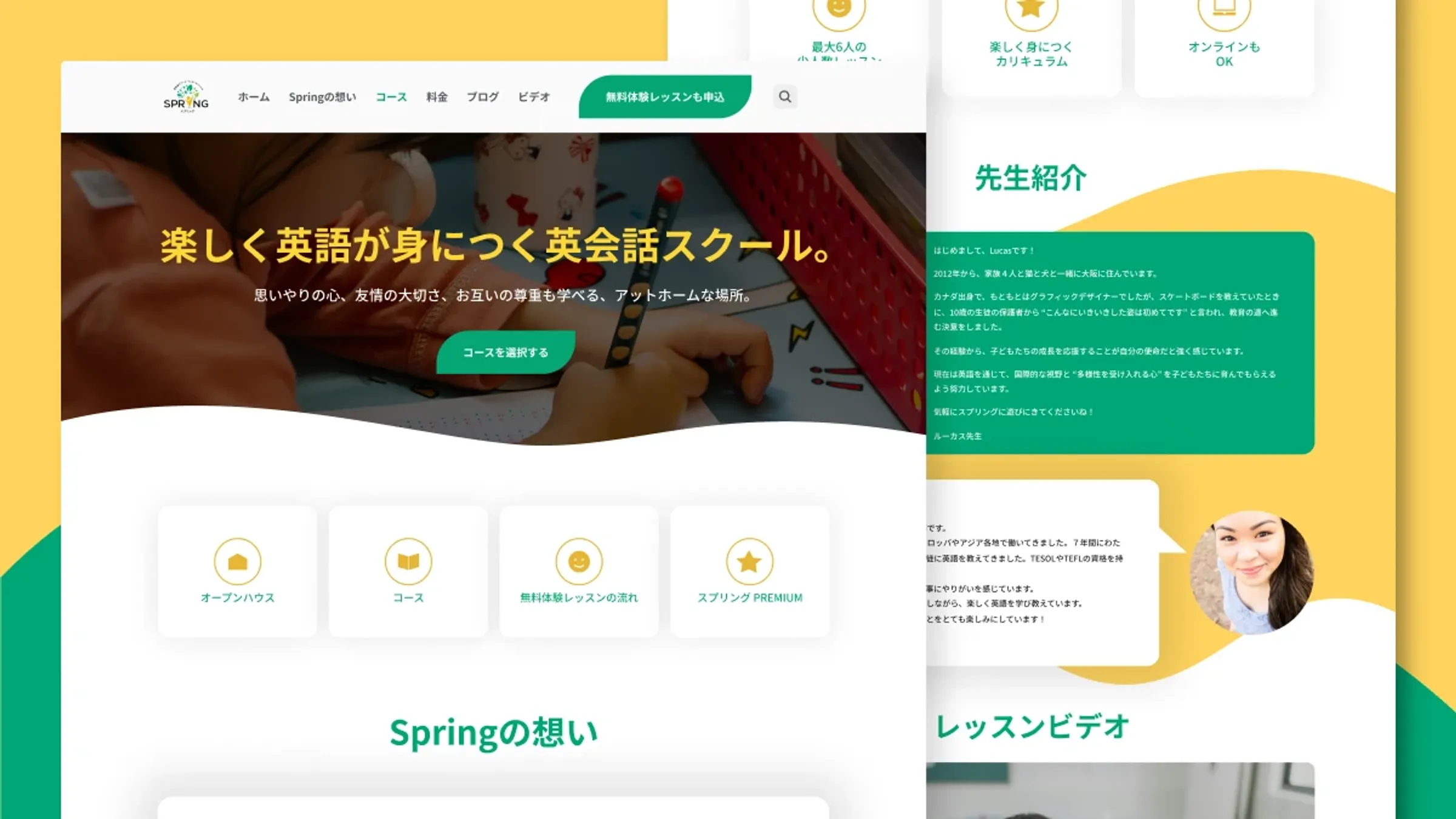
Every age group — toddlers to adults — shared one crowded page. After the redesign (launched alongside other growth efforts, comparing similar six-month periods):
- 58% more visitors
- Visitors spent almost double the time exploring the site
- 22% more pages viewed per visit
01Background
Spring Learning is an English language school in Japan with courses across ages and skill levels. Students struggled to find the right course — and staff struggled to keep information current. The goal was twofold: redesign course discovery, and build a system a non-technical team could maintain on their own.
02The challenge
Two barriers stood between families and the right course:
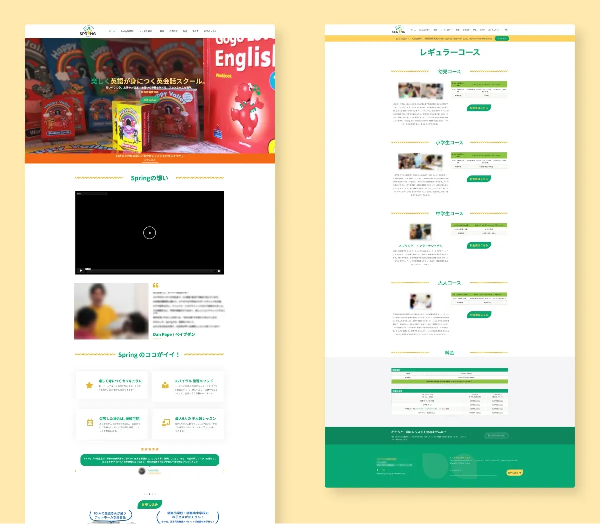
- Everything on one long page. Parents of toddlers and adult learners landed in the same place and scrolled through everyone else's courses to find their own.
- Not enough detail to decide. Descriptions lacked curriculum, teacher background and learning outcomes — so parents emailed the school for basics.
03What I did
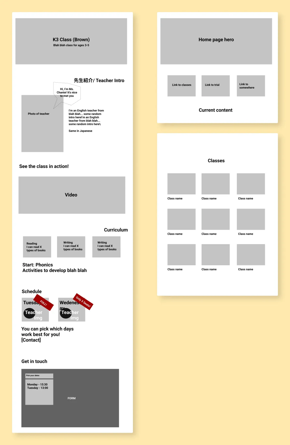
I worked with the team to decide what mattered most — we landed on curriculum, teacher, learning outcomes and trial lessons — and validated direction with quick wireframes before any build. A review of schools like AEON, Nico Kids and ECC confirmed parents already expect age-and-level groupings with a page per course.
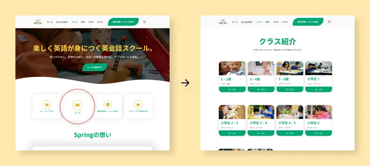
- Dedicated course pages organized by age and skill level
- Scalable, accessible templates staff update without technical support
- Clearer navigation and accessibility improvements throughout
04Reflection
The key decision was one page per course, not one page for all. A comparison page would have meant less clicking — but dedicated pages gave each course room to persuade, and gave the team a template for growth. The design stayed in production until the business was acquired in 2024.
Want the full process — research, iterations and the feedback that changed the design? Read the extended version →