Extended project · Brand identity & web
A mythology publisher that feels ancient — and easy to use
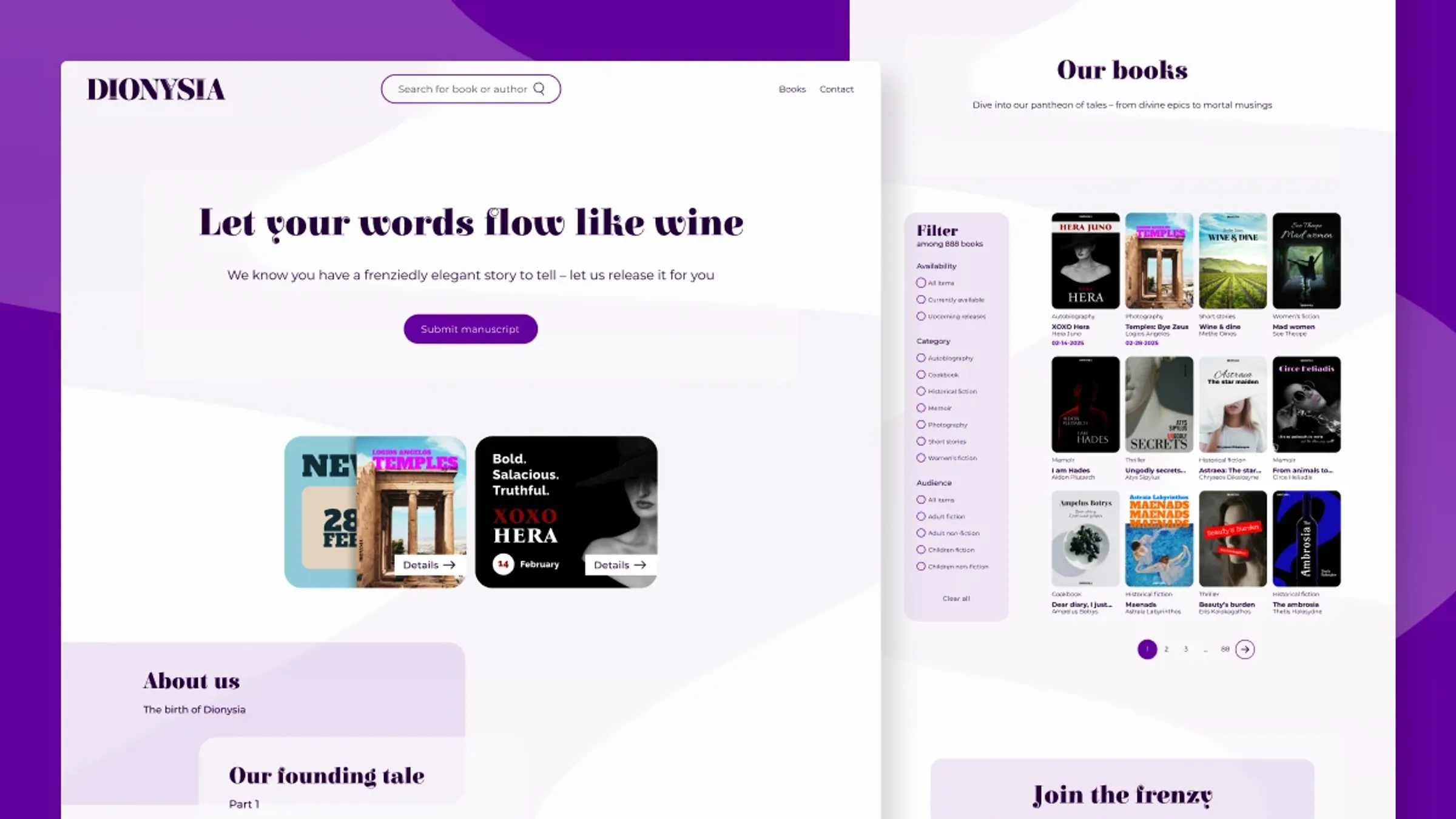
Extended case study — includes research, iterations and feedback rounds. Short on time? Read the condensed version →
01The challenge
Build an independent publisher from nothing: a complete brand identity plus a responsive website with a homepage, book catalog and two book campaigns. The focus, voice and branding were mine to define.
So I gave myself a rule to make the freedom useful: find one concept strong enough to shape every design decision, distinctive without scaring off modern readers.
02Why Dionysus
I needed a niche that could carry a whole brand and give it a clear place in the market. Greek mythology, and Dionysus specifically, checked every box:
A world of storytelling
- Greek myth is a bottomless source of stories. A publisher with a built-in library.
Relatable & human
- Dionysus stands for joy, wine, theater and change. Myth that feels human, not distant.
Rich visual language
- Gods, symbols and rituals gave me recognizable material to design with.
Built-in design system
- Dionysian symbols could become consistent, meaningful brand elements.
Every design decision should connect to Dionysus.
That one rule kept me on track and on schedule. With a clear direction there was no time lost wandering. Dionysia, named after the ancient festivals honoring Dionysus, became a niche house for mythology, wine and celebration.
03Research
A competitive look at publishers, both established houses and independents, confirmed the position: for a small publisher, a strong brand concept is how you stand out. Mythological research through Britannica and the Acropolis Museum gave me the recurring symbols worth building on: the chalice, the grapevine, wine purple.
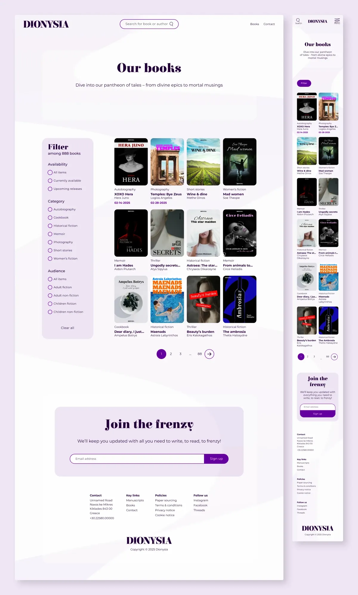
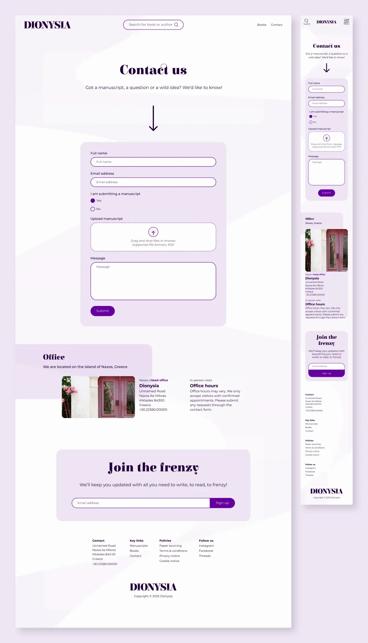
To keep the myth from taking over, I grounded the design in familiar principles: clear visual hierarchy, simplicity first with mythology second, and conventions over novelty for navigation, book displays and forms. Users get a site they already know how to use. The brand lives in everything around that.
Sources
- Britannica (2024). Dionysus.
- Acropolis Museum. Sanctuary and the theatre of Dionysus.
- Krug, S. (2014). Don't Make Me Think, Revisited.
- Colborne, G. (2011). Simple and Usable.
04Process: moodboard, logo, structure
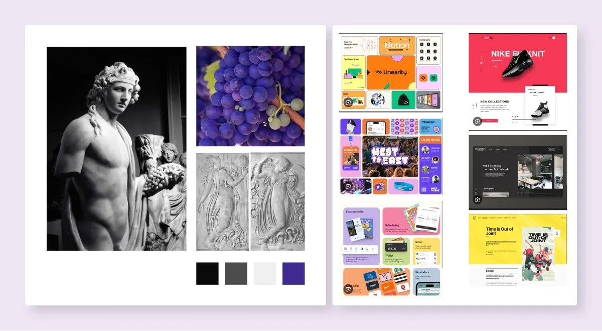
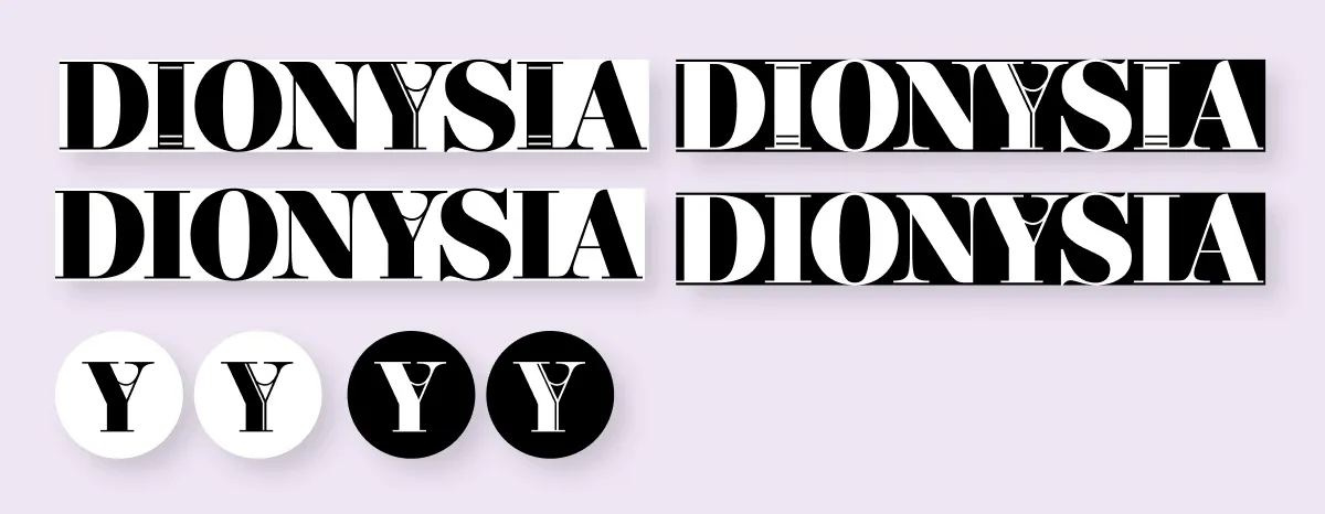
The logo is a chalice, Dionysus' own symbol. I liked the double meaning: the drop that overflows the glass and spills out a story. Hera's tell-all autobiography, maybe. A book about temples that's rude about Zeus.
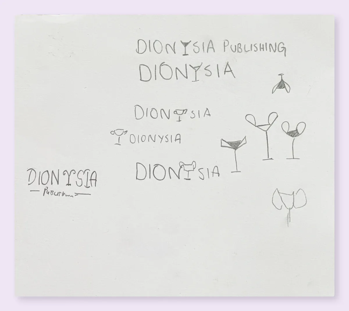
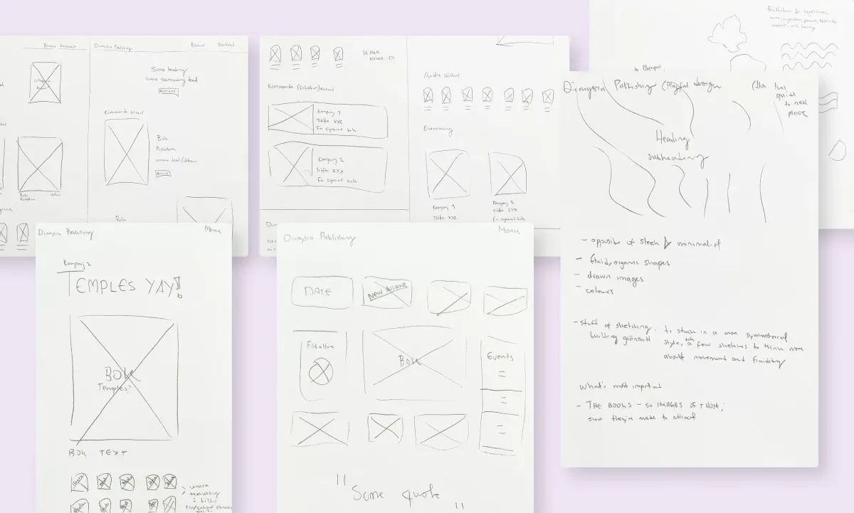
Paper before pixels. I sketched layout options on paper first, which kept structure and visual design as separate questions. Organize the content and hierarchy first. Add the organic, mythological layer second.
05The design
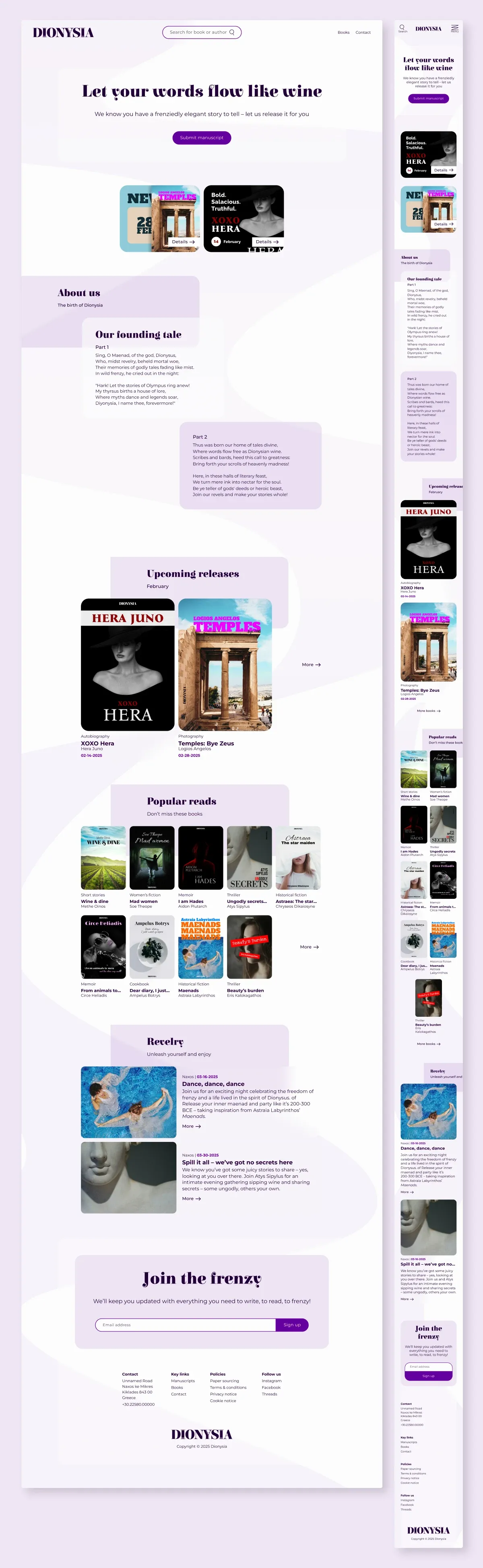
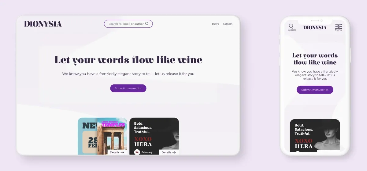
The identity. Wine purple, parchment cream and dark charcoal. Elsie, an organic serif with real personality, for headings. Montserrat keeping the body text grounded and readable. The voice is celebratory, bold and literary: “Let your words flow like wine.”
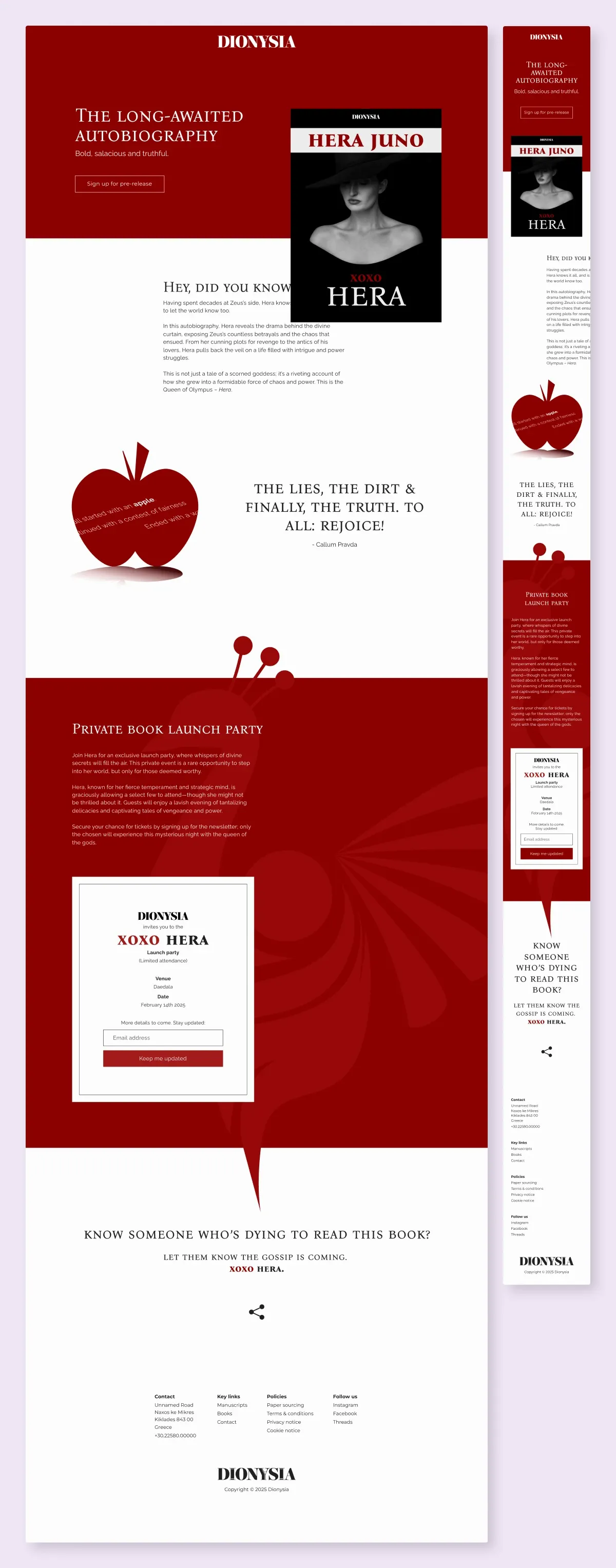
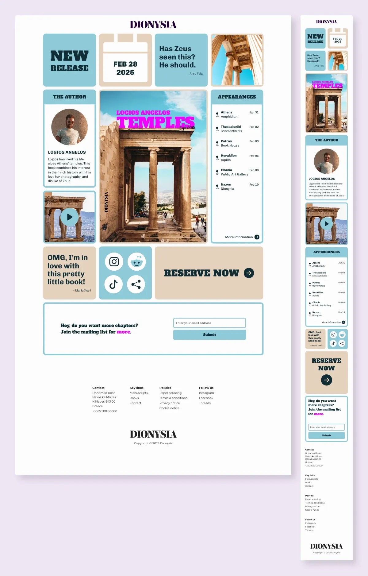
The campaigns let each book lead. Instead of forcing Dionysus onto every promotion, I took the visual direction from the featured book itself:
06What I learned
- Choosing your own constraints is a skill. “Mythology” was too broad to guide anything. “Dionysus” was specific enough to sharpen every decision, and it made the project more fun.
- Brand expression is decided by what you cut. I wanted more symbols in there. The design got better every time I asked why something was in it and couldn't answer.
- Paper sketching protects structure. Ideas were cheap to try and cheap to discard, before color and type could talk me into anything.